awesome. creates — a website for sheffield:air
We recently launched the new website for Sheffield:Air — a world-class team of interdisciplinary scientists addressing the most pressing local, national and international air pollution problems.
Based at the University of Sheffield, they provide solutions through innovative and action-oriented research projects working with government and community partners to address air quality issues.
We’re personally interested in sustainability at awesome. and really believe in the work that they do — so it was great to get involved with their new brand and website. And while we’re not scientists, we know all about brand and design; which is why we sat down with Dan to take us through the creative process.
Let’s start at the beginning.
Dan: Sheffield:Air is a research group; a team of experts, scientists, all around the world doing research around air quality. They wanted to be a more proactive online about the R&D work that they’re doing and asked us to build the website and come up with an identity. They previously had a Wix website, but it wasn’t purpose-built. They relayed to us that they didn’t want to have a lacklustre brand identity that wouldn’t stand out – they wanted the brand to be modern and really well considered.
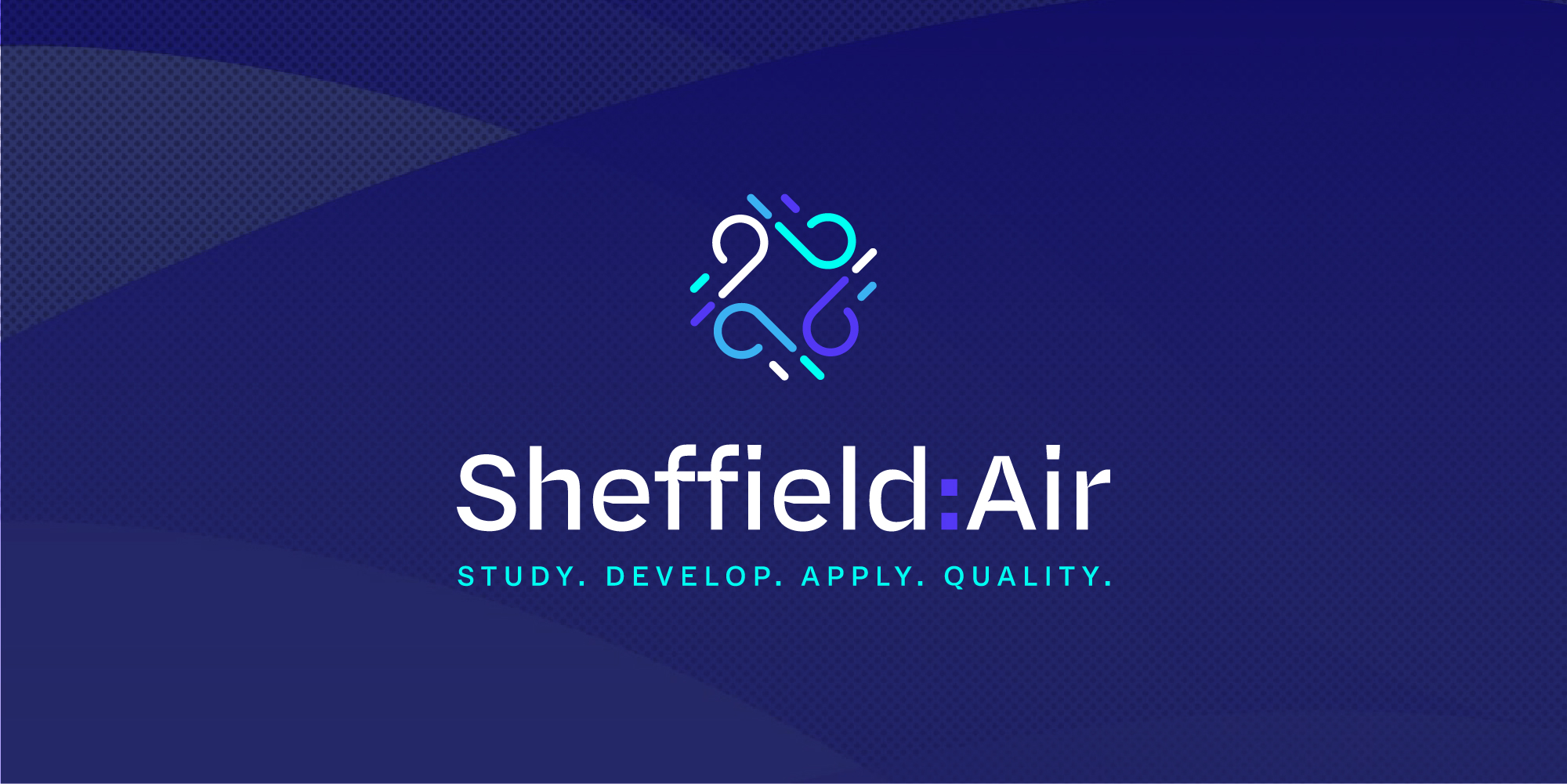
We began by creating this really intuitive logo. It needed to be kept with quite corporate with colours that work nicely against the University of Sheffield logo. I wanted it to feel vivid and positive — something that really stood out. I also came up with the four mission words: study, develop, apply, quality. They link back into the four air quality divisions in the logo.
Any other considerations around brand?
Dan: I don’t profess to be an expert in air quality by any stretch, but I’m interested and care about the subject. I’m quite an eco-concious person, so I found the work relevant to my personal lifestyle and the way I go about things. I really wanted to be able to clearly communicate the message behind these important subjects, such as air quality, living healthier and more positively. As always, it’s all about creating something that’s captivating; that starts with producing work that’s considered and designs.
The colours, for example, are based on different treatments to air and sky. I’m a big advocate for colour theory and harmony in general. Using a deeper blue for instance, to represent the way that air quality changes throughout the day.
Overall, it was about applying these considerations to the concept when it comes to design, but also adding that bit of pizazz and making it feel approachable too.
Website design, build, UX — how did these come into play?
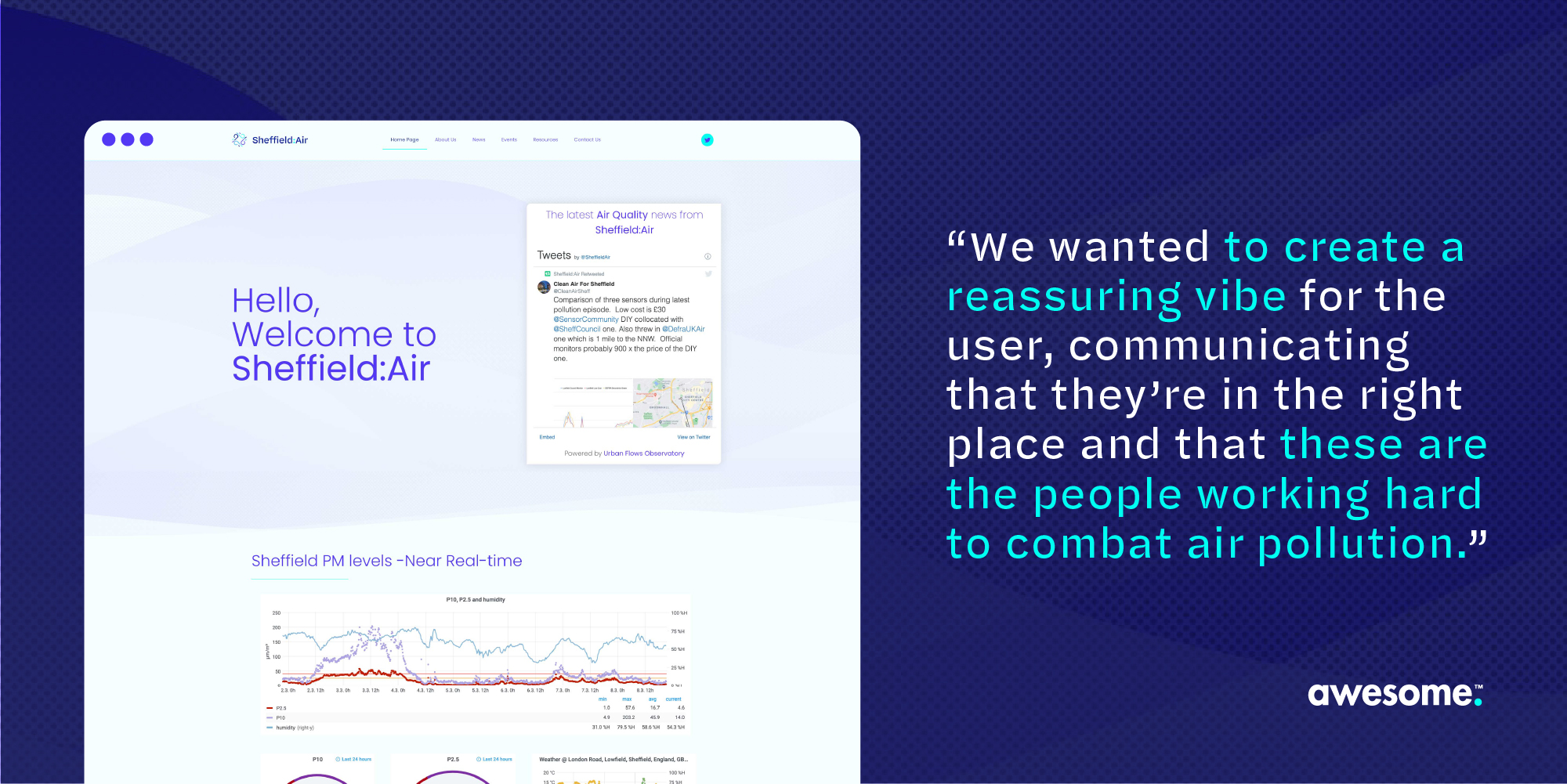
So Sheffield:Air had a list a deliverables — the things their site needed to showcase. The core purpose of the site is for people to be able to see what Sheffield:Air are doing in terms of research and read the white papers they publish. It wasn’t about reinventing the wheel when it came to the website — it needed to be informative and easy to use.
One of our challenges was to balance the design being both formal and refreshing. We wanted it to be visual and aspirational, so that beyond the data people could understand its applications really easily and how the work impacts the area they live in. We made some really considered choices around image placement and space for imagery.
Language-wise, it’s informative but friendly. We want it to feel inclusive — and not like there’s a massive barrier between the research on air quality and how it applies to people’s
We applied a lot of orthodox methods to the website that we’d use when we’re trying to boost lead generation, like various call to actions. But the purpose of the website isn’t lead generation — it’s about being inclusive, getting people involved and making Sheffield more sustainable and eco-friendly.
What’s creating the biggest impact when it comes to the site?
Dan: It’s the small details that make a big difference. Like, they have a really good network on Twitter, so we brought that to the top of the site so it can feel super live. And then there’s the transitions that happen as you go down the menu; we put a slide in there to replicate blowing air, to create this calming essence. It’s just those small visual aesthetics that subtly create impact as a whole. Like the graphic in the hero which is influenced by the movement of air where it travels — but we’ve added a bit of texture into the graphic that resembles air particles.
It’s really important to us to design with purpose and intention, which is what we think we’ve done here. Even though it’s a static website it’s got this nice, calming energy to it. We wanted to create this reassuring vibe for the user accessing it like, you’re in the right place, these are the people working hard to combat air pollution. There’s a really positive feeling about it all.
Definitely. Any final thoughts Dan?
Dan: Just that we appreciate the team for putting this trust in us. We take a lot of pride in that, because the work that they do is really important. I think being part of this journey that promotes air quality is really exciting. I’ve learned a lot; it’s something I’ve taken beyond the project. Just being more conscious about about the things I can do to improve air quality in South Yorkshire. I personally feel what we’ve learned from working on this brand and site is brilliant, and hopefully we can keep supporting their efforts and do what we can.